Khaadi, one of Pakistan’s leading fashion and lifestyle brand has recently dropped its name from the logo, becoming the first brand in the country to take such a step.
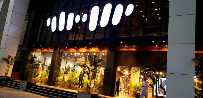
The stylized logo with ten oblong shapes, symbolizing fingers on a hand loom, now essentially stands alone.
Moreover, Khaadi had already released the new rebranding through its Facebook page in November 2018 and has recently unveiled it at one of its retail outlets.
https://www.facebook.com/khaadi/photos/a.10150614555554075/10156197361154075/?type=3
The new logo was spotted at its newest branch at Bilawal Chorangi, Karachi
According to Anjum Nida Rahman, Director Corporate Communication Khaadi, the brand’s vision behind the move was to celebrate 20 years of inception.
WE FEEL DROPPING OUR NAME IS LIKE GRADUATING- WE HAVE COMPLETED 20 YEARS AS A BRAND AND HAVE REACHED THE HIGHEST LEVEL OF BRAND EQUITY
She shared further that the logo alone is now powerful enough to represent Khaadi across all platforms.
WE NO LONGER NEED TO WRITE IT. OUR LOGO IS SYNONYMOUS WITH OUR NAME. THE FINGERS SHOW CRAFT (OUR ROOTS) A MANS FINGERS ON A HANDLOOM. IT ALSO SHOWS RESILIENCE, UNITY AND TEAMWORK PERSEVERANCE AND STRENGTH TO DEFY THE ODDS. IT SAYS WE ARE KHAADI.
Khaadi now boasts a glorious journey across 20 years of its establishment. What essentially began as a 400 square foot store in Zamzama, has now expanded to over 500000 square feet of retail space with 45 outlets nationwide and 20 overseas.
Behemoth brands like Starbucks, Apple, and Shell have already adopted the same strategy earlier.
It is indeed a proud moment for a Pakistani brand like Khaadi which has managed to establish itself at a level remarkable enough to implement ‘Nameless logos’ nationwide as well as internationally.
Stay tuned to Brand Voice for more updates.