Coca-Cola Revamps Its Packaging, Reveals One Brand Marketing Strategy

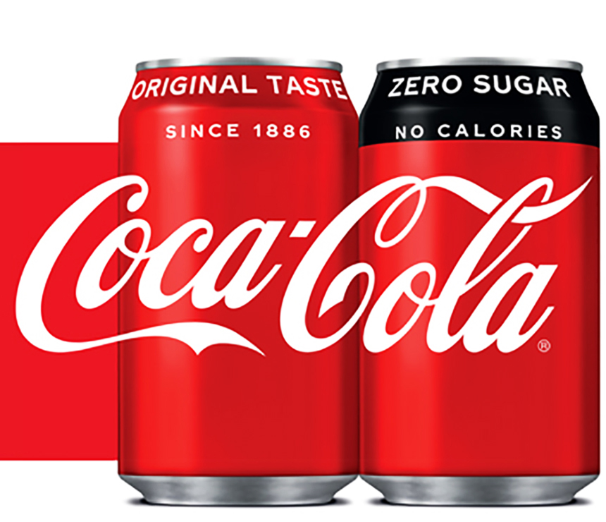
Coca Cola has made headlines all across the world. One of the world’s most recognizable brands has opted for a one brand marketing strategy in terms of its packaging. The brand has launched new graphics that use one visual identity system featuring Coca-Cola Red as a unifying color across the Trademark.
In addition to this, Coca-Cola has recently changed its recipe of the zero sugar to match its taste with the original version is the first one to lead the design update. After the new Coca-Cola zero sugar’s packaging, the same packaging design will be introduced in other flavors.
“Packaging is our most visible and valuable asset,” said Marcos de Quinto, Chief Marketing Officer, The Coca-Cola Company. “The Coca-Cola Red Disc has become a signature element of the brand, synonymous with great taste, uplift and refreshment. By applying it to our packaging in such a bold way, we are taking the next step towards full adoption of the “One Brand” strategy, uniting the Coca-Cola family under one visual identity and making it even easier for consumers to choose their Coca-Cola with or without calories, with or without caffeine.”
“The unification of the brands through design, marks the first time in our 130-year history that the iconic Coca-Cola visual identity has been shared across products in such a prominent way,” said James Sommerville, Vice President Global Design, The Coca-Cola Company. “When applied across packaging, retail, equipment and experiential, this new approach becomes a global design language that utilizes a historical brand icon to present the range of Coca-Cola products available today in a contemporary and simple way.”
Stay tuned to Brand Voice for more news and updates!
